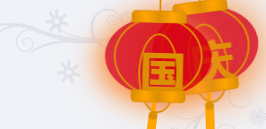
最近看到很多網(wǎng)站都掛了燈籠,搬過來水篇文章,最初出處也無從考證了,修復(fù)了一點兼容性問題,共分享兩種方法,各有各的優(yōu)勢,站長朋友可以自行取舍,不過展示效果都差不多。感興趣的照下文添加吧,效果如圖所示。
方法一:
第一步、添加HTML代碼
將下面的HTML代碼添加到主題頁腳模板footer.php,</body>標(biāo)簽的上面。
<!-- 燈籠1 -->
<div class="deng-box">
    <div class="deng">
        <div class="xian"></div>
        <div class="deng-a">
            <div class="deng-b"><div class="deng-t">慶</div></div>
        </div>
        <div class="shui shui-a"><div class="shui-c"></div><div class="shui-b"></div></div>
    </div>
</div>

<!-- 燈籠2 -->
<div class="deng-box1">
    <div class="deng">
        <div class="xian"></div>
        <div class="deng-a">
            <div class="deng-b"><div class="deng-t">國</div></div>
        </div>
        <div class="shui shui-a"><div class="shui-c"></div><div class="shui-b"></div></div>
    </div>
</div>
因為代碼中有中文,編輯后需要將模板文件保存為UTF-8 無BOM(無簽名)的格式,后臺主題編輯中修改可以忽略,上面的代碼可以只加一個,個人感覺掛兩個燈籠更靈動些。
第二步、添加樣式
將樣式代碼添加到WP后臺 → 外觀 → 自定義 → 額外CSS 中,點擊“發(fā)布”即可。
.deng-box {
    position: fixed;
    top: -40px;
    right: -20px;
    z-index: 1999;
}

.deng-box1 {
    position: fixed;
    top: -30px;
    right: 10px;
    z-index: 1999;
}

.deng-box1 .deng {
    position: relative;
    width: 120px;
    height: 90px;
    margin: 50px;
    background: #d8000f;
    background: rgba(216, 0, 15, 0.8);
    border-radius: 50% 50%;
    -webkit-transform-origin: 50% -100px;
    -webkit-animation: swing 5s infinite ease-in-out;
    animation: swing 5s infinite ease-in-out;
    box-shadow: -5px 5px 30px 4px rgba(252, 144, 61, 1);
}

.deng {
    position: relative;
    width: 120px;
    height: 90px;
    margin: 50px;
    background: #d8000f;
    background: rgba(216, 0, 15, 0.8);
    border-radius: 50% 50%;
    -webkit-transform-origin: 50% -100px;
    -webkit-animation: swing 3s infinite ease-in-out;
    animation: swing 3s infinite ease-in-out;
    box-shadow: -5px 5px 50px 4px rgba(250, 108, 0, 1);
}

.deng-a {
    width: 100px;
    height: 90px;
    background: #d8000f;
    background: rgba(216, 0, 15, 0.1);
    margin: 12px 8px 8px 10px;
    border-radius: 50% 50%;
    border: 2px solid #dc8f03;
}

.deng-b {
    width: 45px;
    height: 90px;
    background: #d8000f;
    background: rgba(216, 0, 15, 0.1);
    margin: -4px 8px 8px 26px;
    border-radius: 50% 50%;
    border: 2px solid #dc8f03;
}

.xian {
    position: absolute;
    top: -20px;
    left: 60px;
    width: 2px;
    height: 20px;
    background: #dc8f03;
}

.shui-a {
    position: relative;
    width: 5px;
    height: 20px;
    margin: -5px 0 0 59px;
    -webkit-animation: swing 4s infinite ease-in-out;
    -webkit-transform-origin: 50% -45px;
    background: #ffa500;
    border-radius: 0 0 5px 5px;
}

.shui-b {
    position: absolute;
    top: 14px;
    left: -2px;
    width: 10px;
    height: 10px;
    background: #dc8f03;
    border-radius: 50%;
}

.shui-c {
    position: absolute;
    top: 18px;
    left: -2px;
    width: 10px;
    height: 35px;
    background: #ffa500;
    border-radius: 0 0 0 5px;
}

.deng:before {
    position: absolute;
    top: -7px;
    left: 29px;
    height: 12px;
    width: 60px;
    content: " ";
    display: block;
    z-index: 1999;
    border-radius: 5px 5px 0 0;
    border: solid 1px #dc8f03;
    background: #ffa500;
    background: linear-gradient(to right, #dc8f03, #ffa500, #dc8f03, #ffa500, #dc8f03);
}

.deng:after {
    position: absolute;
    bottom: -7px;
    left: 10px;
    height: 12px;
    width: 60px;
    content: " ";
    display: block;
    margin-left: 20px;
    border-radius: 0 0 5px 5px;
    border: solid 1px #dc8f03;
    background: #ffa500;
    background: linear-gradient(to right, #dc8f03, #ffa500, #dc8f03, #ffa500, #dc8f03);
}

.deng-t {
    font-family: 華文行楷,Arial,Lucida Grande,Tahoma,sans-serif;
    font-size: 3.2rem;
    color: #dc8f03;
    font-weight: bold;
    line-height: 85px;
    text-align: center;
}

.night .deng-t,
.night .deng-box,
.night .deng-box1 {
    background: transparent !important;
}

@keyframes swing {
    0% { transform: rotate(-10deg) }
    50% { transform: rotate(10deg) }
    100% { transform: rotate(-10deg) }
}

@-moz-keyframes swing {
    0% { -moz-transform: rotate(-10deg) }
    50% { -moz-transform: rotate(10deg) }
    100% { -moz-transform: rotate(-10deg) }
}

@-webkit-keyframes swing {
    0% { -webkit-transform: rotate(-10deg) }
    50% { -webkit-transform: rotate(10deg) }
    100% { -webkit-transform: rotate(-10deg) }
}
也可以將樣式代碼直接加到主題樣式文件style.css的最后。可能燈籠上的文字字號在有些主題上有點大,可以適當(dāng)修改第133行的字號:font-size: 3.2rem;
如果被其他圖層擋住了,請修改5,12,111行 z-index 的值。
添加判斷函數(shù)
如果只想在首頁顯示燈籠,可以用下面的判斷語句把上面的代碼包裹起來:
<?php if (is_home()) { ?>
<!-- 代碼放這里 -->
<?php } ?>
手機移動端不顯示:
<?php if (!wp_is_mobile()) { ?>
<!-- 代碼放這里 -->
<?php } ?>
方法二:
這個燈籠只是簡單應(yīng)用一下CSS3動畫,純HTML+CSS手敲出來的,由于時間短寫的,不是很嚴(yán)謹(jǐn),但不影響使用,具體實現(xiàn)方法,看下面的代碼,給網(wǎng)站掛上新春燈籠,頂部左右兩邊新年快樂代碼。同理,改成國慶快樂四個字也是可以了,或者改成只顯示兩個燈籠。
<div class="deng-box2">
  <div class="deng">
    <div class="xian"></div>
    <div class="deng-a">
      <div class="deng-b">
        <div class="deng-t">年</div>
      </div>
    </div>
    <div class="shui shui-a">
      <div class="shui-c"></div>
      <div class="shui-b"></div>
    </div>
  </div>
</div>
<div class="deng-box3">
  <div class="deng">
    <div class="xian"></div>
    <div class="deng-a">
      <div class="deng-b">
        <div class="deng-t">新</div>
      </div>
    </div>
    <div class="shui shui-a">
      <div class="shui-c"></div>
      <div class="shui-b"></div>
    </div>
  </div>
</div>
<div class="deng-box1">
  <div class="deng">
    <div class="xian"></div>
    <div class="deng-a">
      <div class="deng-b">
        <div class="deng-t">樂</div>
      </div>
    </div>
    <div class="shui shui-a">
      <div class="shui-c"></div>
      <div class="shui-b"></div>
    </div>
  </div>
</div>
<div class="deng-box">
  <div class="deng">
    <div class="xian"></div>
    <div class="deng-a">
      <div class="deng-b">
        <div class="deng-t">快</div>
      </div>
    </div>
    <div class="shui shui-a">
      <div class="shui-c"></div>
      <div class="shui-b"></div>
    </div>
  </div>
</div>
<style type="text/css">.deng-box {
  position: fixed;
  top: -40px;
  right: -20px;
  z-index: 9999;
  pointer-events: none
}

.deng-box1 {
  position: fixed;
  top: -30px;
  right: 10px;
  z-index: 9999;
  pointer-events: none
}

.deng-box2 {
  position: fixed;
  top: -40px;
  left: -20px;
  z-index: 9999;
  pointer-events: none
}

.deng-box3 {
  position: fixed;
  top: -30px;
  left: 10px;
  z-index: 9999;
  pointer-events: none
}

.deng-box1 .deng, .deng-box3 .deng {
  position: relative;
  width: 120px;
  height: 90px;
  margin: 50px;
  background: #d8000f;
  background: rgba(216, 0, 15, .8);
  border-radius: 50% 50%;
  -webkit-transform-origin: 50% -100px;
  -webkit-animation: swing 5s infinite ease-in-out;
  box-shadow: -5px 5px 30px 4px #fc903d
}

.deng {
  position: relative;
  width: 120px;
  height: 90px;
  margin: 50px;
  background: #d8000f;
  background: rgba(216, 0, 15, .8);
  border-radius: 50% 50%;
  -webkit-transform-origin: 50% -100px;
  -webkit-animation: swing 3s infinite ease-in-out;
  box-shadow: -5px 5px 50px 4px #fa6c00
}

.deng-a {
  width: 100px;
  height: 90px;
  background: #d8000f;
  background: rgba(216, 0, 15, .1);
  margin: 12px 8px 8px 8px;
  border-radius: 50% 50%;
  border: 2px solid #dc8f03
}

.deng-b {
  width: 45px;
  height: 90px;
  background: #d8000f;
  background: rgba(216, 0, 15, .1);
  margin: -4px 8px 8px 26px;
  border-radius: 50% 50%;
  border: 2px solid #dc8f03
}

.xian {
  position: absolute;
  top: -20px;
  left: 60px;
  width: 2px;
  height: 20px;
  background: #dc8f03
}

.shui-a {
  position: relative;
  width: 5px;
  height: 20px;
  margin: -5px 0 0 59px;
  -webkit-animation: swing 4s infinite ease-in-out;
  -webkit-transform-origin: 50% -45px;
  background: orange;
  border-radius: 0 0 5px 5px
}

.shui-b {
  position: absolute;
  top: 14px;
  left: -2px;
  width: 10px;
  height: 10px;
  background: #dc8f03;
  border-radius: 50%
}

.shui-c {
  position: absolute;
  top: 18px;
  left: -2px;
  width: 10px;
  height: 35px;
  background: orange;
  border-radius: 0 0 0 5px
}

.deng:before {
  position: absolute;
  top: -7px;
  left: 29px;
  height: 12px;
  width: 60px;
  content: " ";
  display: block;
  z-index: 999;
  border-radius: 5px 5px 0 0;
  border: solid 1px #dc8f03;
  background: orange;
  background: linear-gradient(to right, #dc8f03, orange, #dc8f03, orange, #dc8f03)
}

.deng:after {
  position: absolute;
  bottom: -7px;
  left: 10px;
  height: 12px;
  width: 60px;
  content: " ";
  display: block;
  margin-left: 20px;
  border-radius: 0 0 5px 5px;
  border: solid 1px #dc8f03;
  background: orange;
  background: linear-gradient(to right, #dc8f03, orange, #dc8f03, orange, #dc8f03)
}

.deng-t {
  font-family: 華文行楷, Arial, Lucida Grande, Tahoma, sans-serif;
  font-size: 3.2rem;
  color: #dc8f03;
  font-weight: 700;
  line-height: 85px;
  text-align: center
}

.night .deng-box, .night .deng-box1, .night .deng-t {
  background: 0 0 !important
}

@-moz-keyframes swing {
  0% {
    -moz-transform: rotate(-10deg)
  }
  50% {
    -moz-transform: rotate(10deg)
  }
  100% {
    -moz-transform: rotate(-10deg)
  }
}

@-webkit-keyframes swing {
  0% {
    -webkit-transform: rotate(-10deg)
  }
  50% {
    -webkit-transform: rotate(10deg)
  }
  100% {
    -webkit-transform: rotate(-10deg)
  }
}</style>
復(fù)制代碼放到底部模板文件里面即可
免責(zé)聲明:本文內(nèi)容來自用戶上傳并發(fā)布,站點僅提供信息存儲空間服務(wù),不擁有所有權(quán),信息僅供參考之用。